
Get familiar with the Interface
Your interface will look a bit different based on the access you have to a file. An editor will have some more options compared to a viewer.
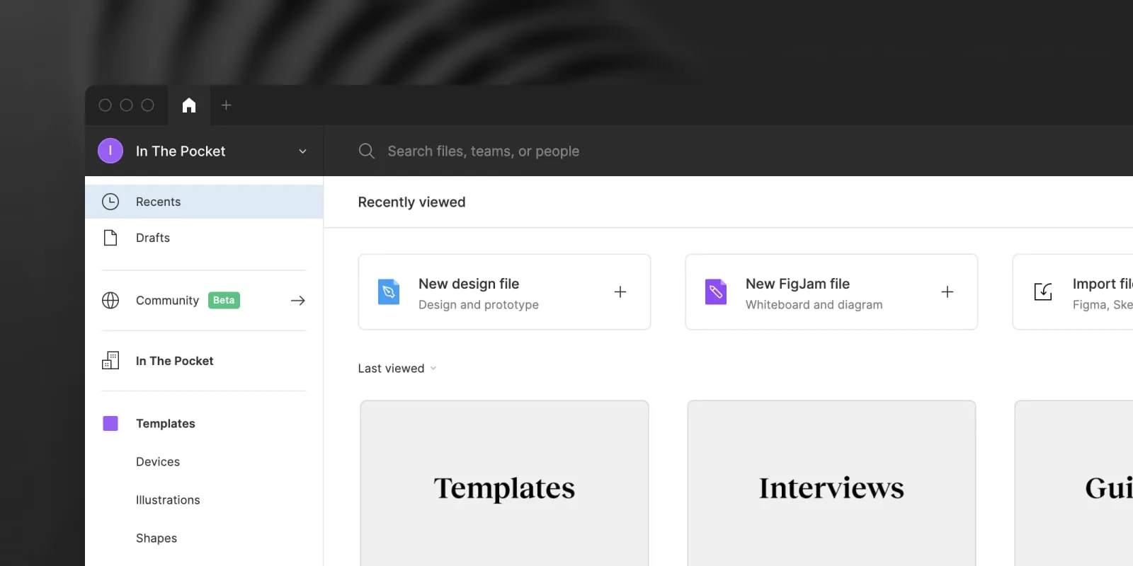
Projects overview
The projects overview shows you what files you've recently viewed or worked on, your drafts and all team projects you are invited to.
Navigation bar
In the navigation bar, you can quickly search a file, view your notifications and change your profile settings.
Recent
The Recent tab shows all files you have recently worked on or viewed. Removing any file here will not delete the actual file.
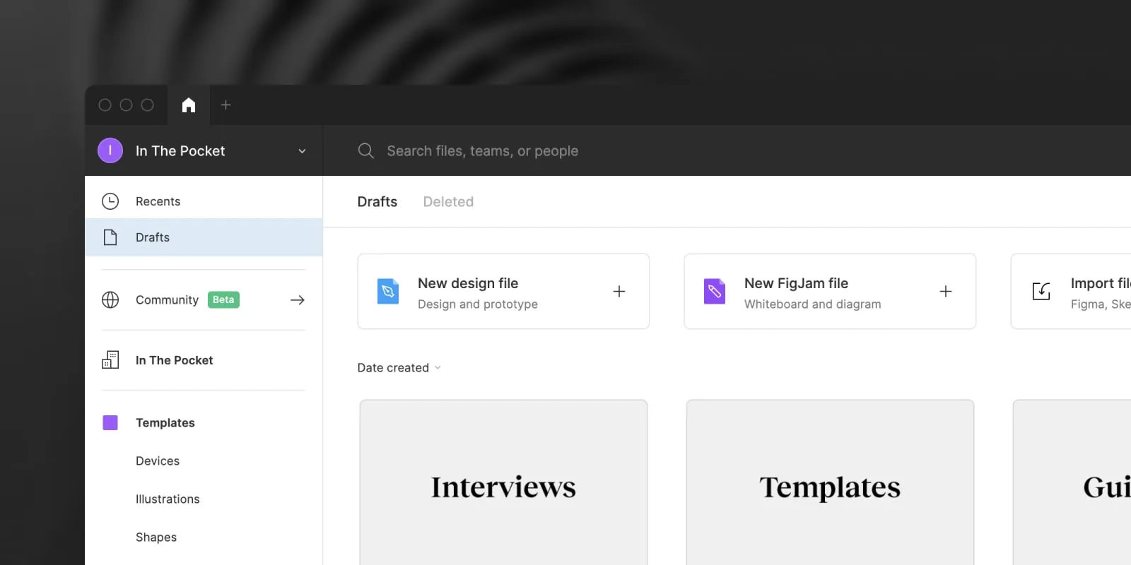
Drafts
Drafts show all of your personal files, these are only visible to you unless you share them with other people. Deleting them will remove them from your Figma account, you will not be able to access them again.
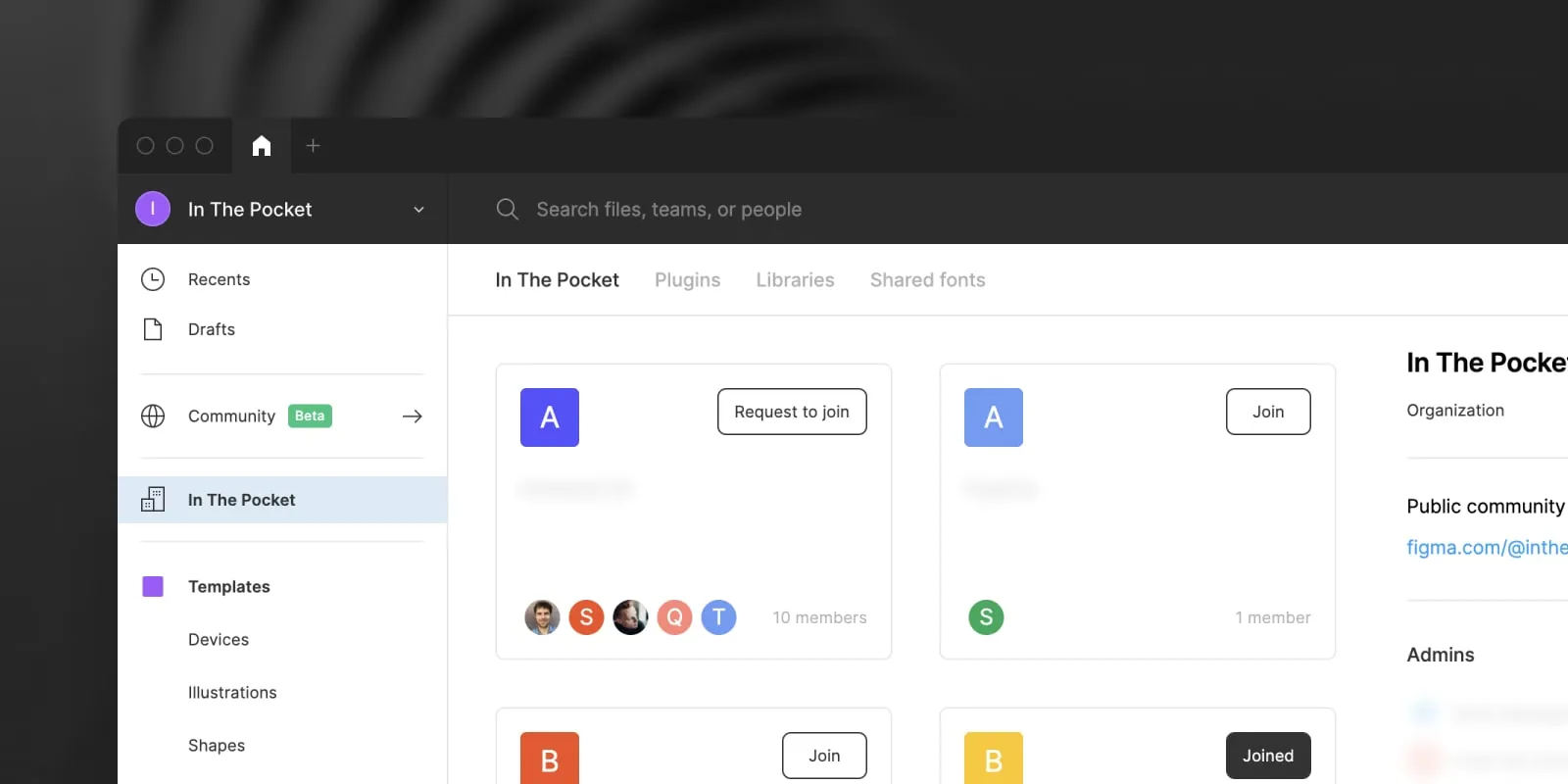
Teams
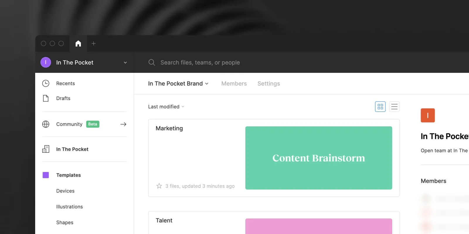
We use teams to group our files per project or team. Some teams are public, hidden or require you to request access. You can ask the designer of your team to add you to the project you are working on. Files in a team are by default visible to all team members (unless you change the access).
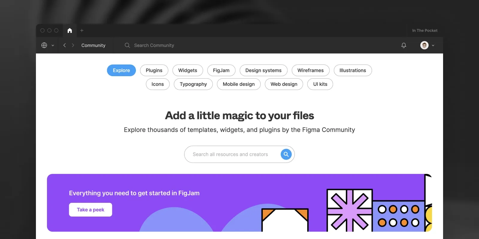
Community
The community tab allows you to search for public files (templates, presentations, mockups, UI Kits, ...) and plugins.
Toolbar
The toolbar has all the tools you need to add elements to the canvas, add comments, share a file, preview a prototype or zoom in. Here's an overview of all tools:
Move (editor only)
The Move (V) tool is used to move elements on the canvas.
If you have view-only access you can use the Move tool to select elements on the canvas.
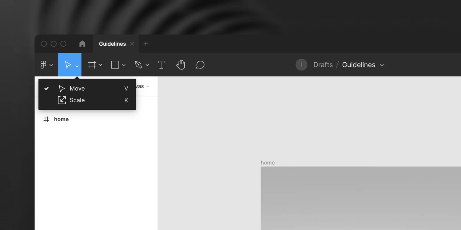
The Scale (K) tool can be used to proportionally scale an element without distorting any part of the selection.

Frame (editor only)
The Frame (F) tool is used to create frames, frames are used to create a screen or a component.
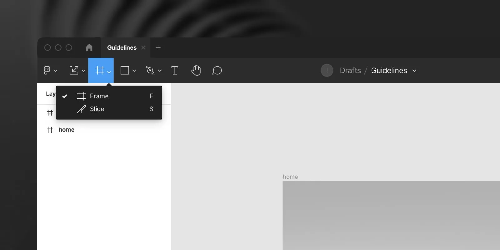
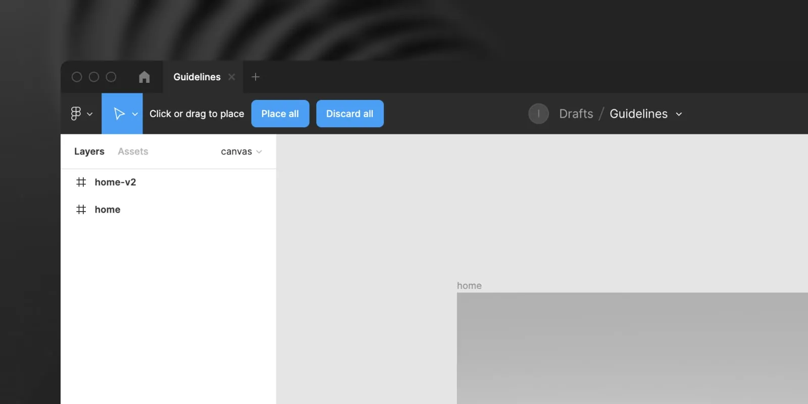
The Slice (S) tool lets you draw a rectangle over any part of the canvas and export it as an image.

Shapes (editor only)
The shape tool lets you insert Rectangles (R), Lines (L), Arrows (shift + L), Ellipse (O), Polygons or Stars
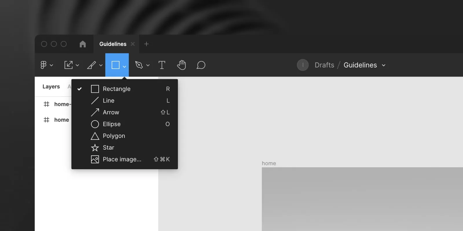
You can add an image by using Place Image (shift + cmd + K) or drag the image on the canvas.
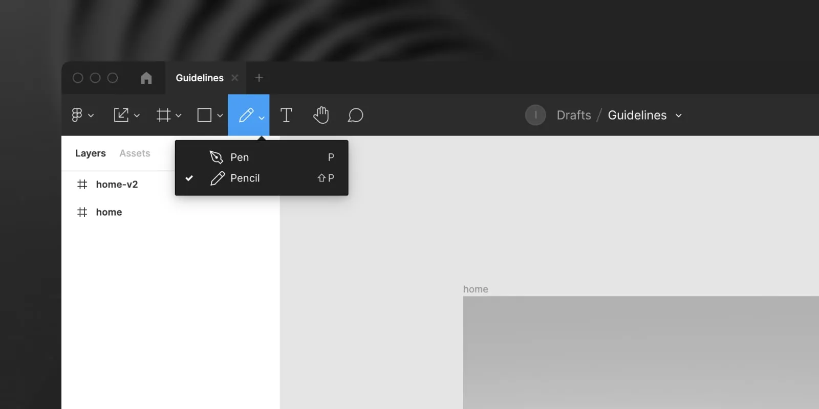
Pen (editor only)
The Pen (P) tool lets you draw vector shapes

The Pencil (shift + P) tool lets you freely draw lines
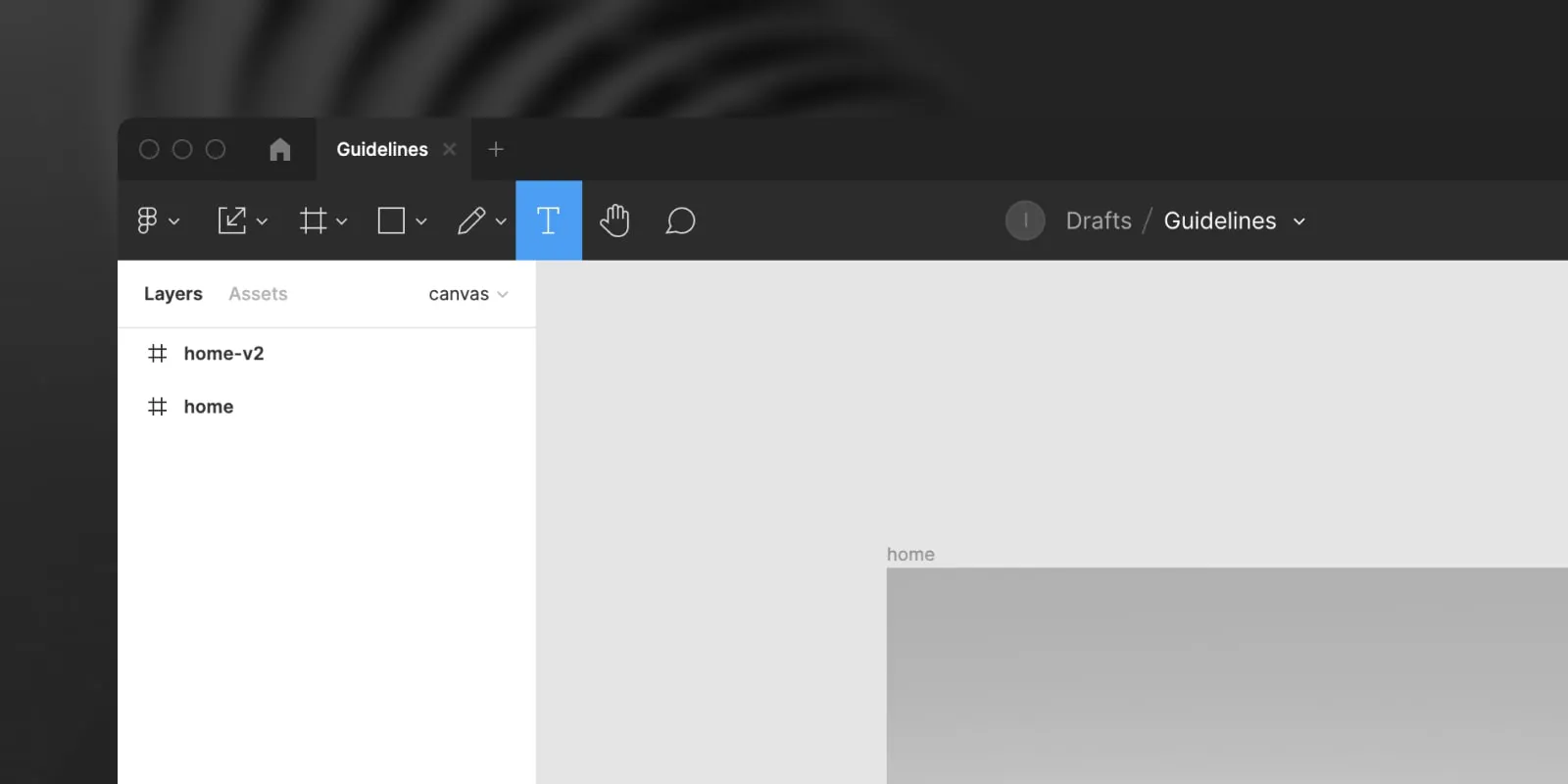
Text (editor only)
The Text (T) tool allows you to quickly add select or add text on the canvas. This is useful when editing the copy of the design, so you don't have to click through all the layers. You just select the Text tool and click on the text you want to change.
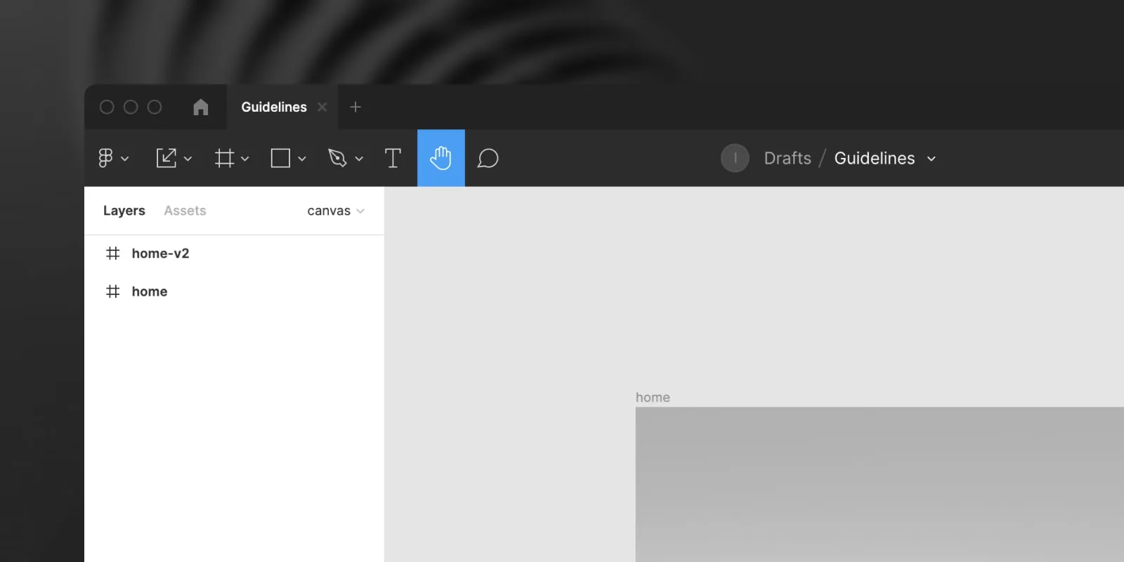
Hand tool
The Hand (H) tool can be used to quickly move the canvas without selecting a layer. You can also move the canvas when you use a trackpad or by holding the space key and dragging the canvas.
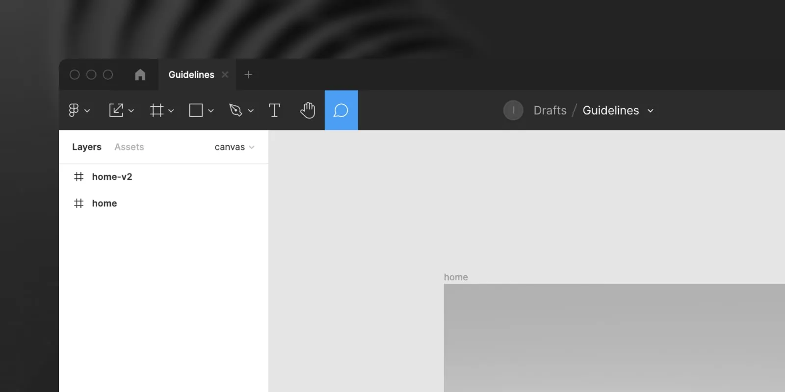
Comments
The Comment (C) tool lets you add a comment on any part of the canvas.
Pages & Layers
On the left you have the Pages and Layers, here you can easily switch between pages and see all elements that are visible on the screen. If you select a layer, it will also be selected on the canvas.
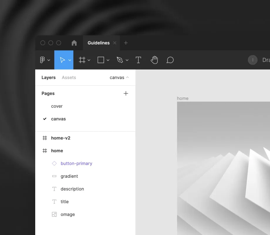
You can easily hide the pages to see more of the layer list. Tap the page name to collapse the pages list.
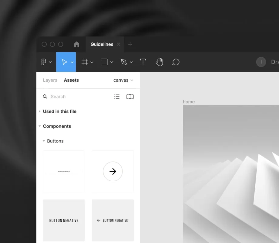
Assets (editor only)
You can also switch to Assets, this will give you an overview of all components that are available in the file or from linked libraries. This can be used to insert components onto the canvas, more on this later.
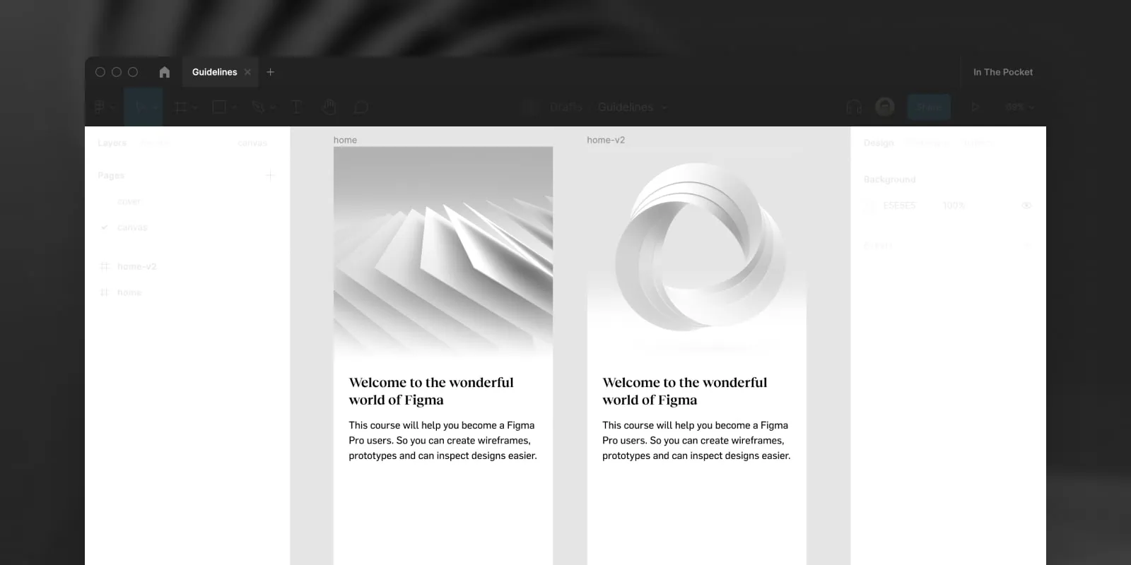
Canvas
The Canvas is where the magic happens. Here you can see all designs, wireframes, flows or anything else that is added to the page.
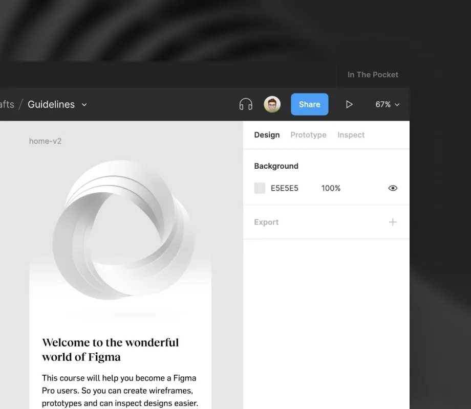
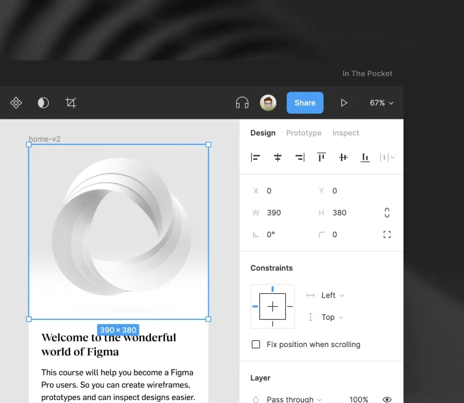
Design (editor only)
On the right, you will find the design tab. Here you can see all properties of your canvas or selected layer. You can change the position, variants and style of the selected elements. If you are an editor this is where you can also export any selected element as an image.
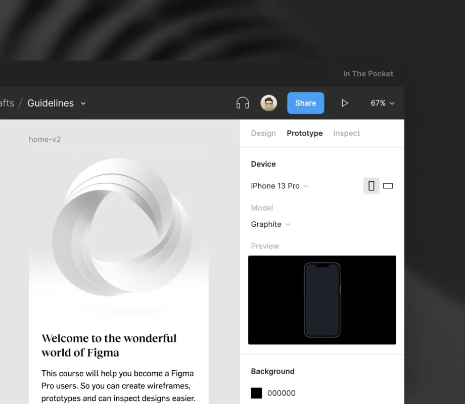
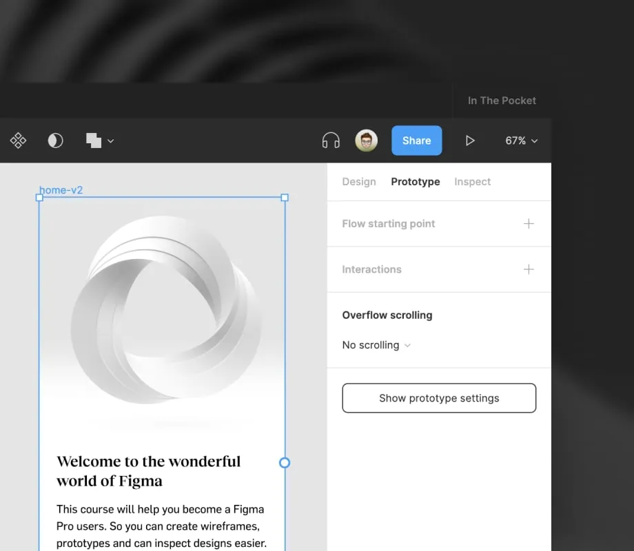
Prototype (editor only)
The prototyping tab allows you to connect frames and create a prototype. This can be used to preview a design, test an animation or validate your designs with users. The options change based on your selection. If nothing is selected you can change the prototype settings (background color and device type). If a frame is selected you can add a starting point, add interactions or change the scrolling behaviour.
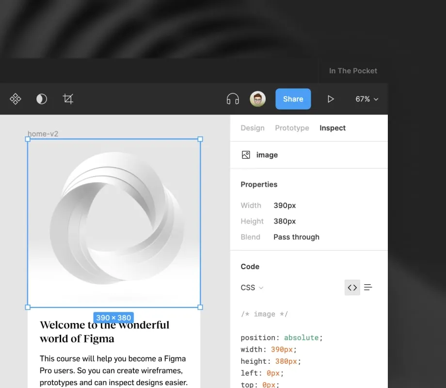
Inspect
The inspect panel will show you more information about the element you selected. This includes properties, colors, component documentation and code snippets. This can be used when implementing a design in code to make sure you use the right spacings, sizes and visual styles.
If you only have a view account you will see a separate Export panel, this allows you to export any element you selected as an image.

Want to get a more in-depth explainer about the interface?
Visit Figma's help pages to get a full overview of how to use the interface.